Time Series Forecasting
Datasiv provides a suite of machine learning components you can embed on top of data sources in your application.
In this sample tutorial, we will show you how to run time series forecasting on historical data in Google Sheets.
Start by creating a new application.
Loading in Google Sheet Data
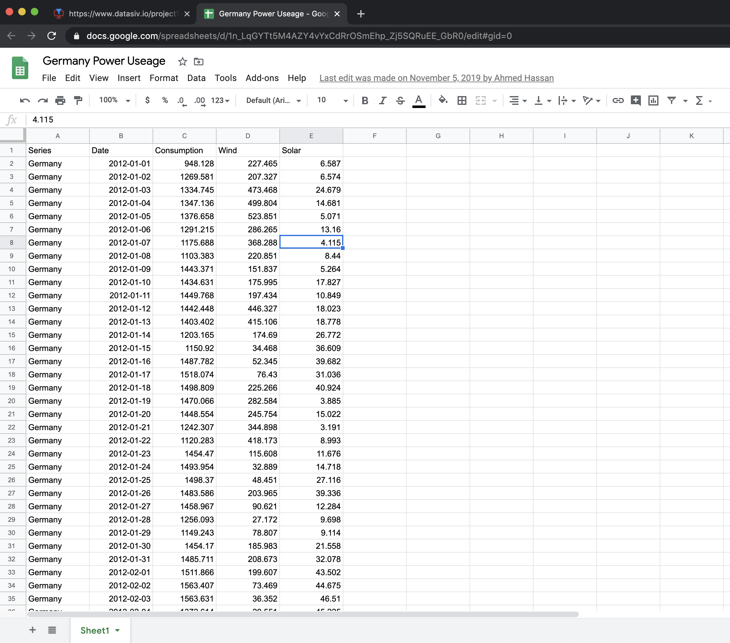
First, we will create a query that loads in historical time series data stored in the Google Sheets at this link: https://docs.google.com/spreadsheets/d/1n_LqGYTt5M4AZY4vYxCdRrOSmEhp_Zj5SQRuEE_GbR0.
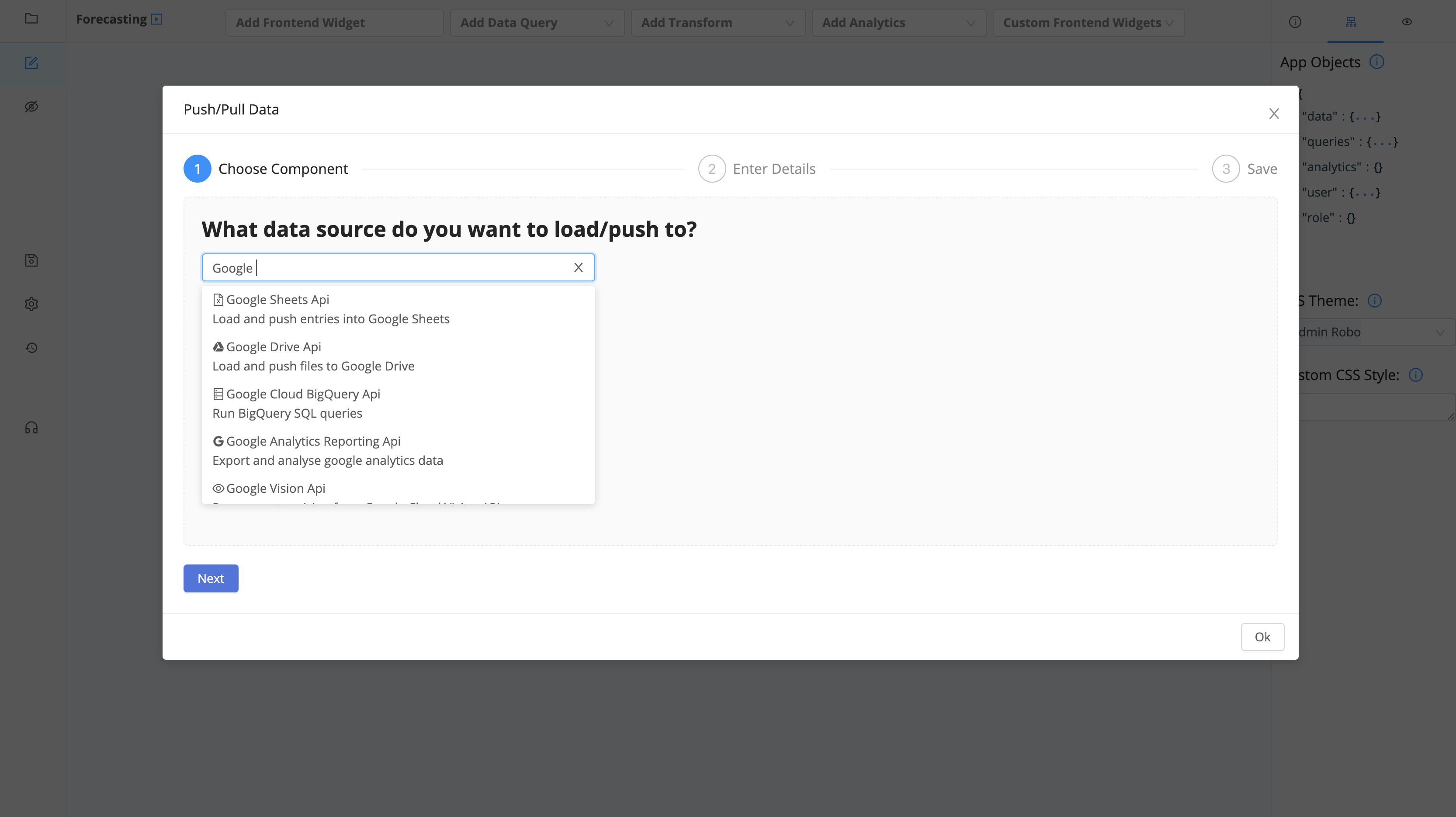
First, click Add Data Query and select Google Sheets Api.
Use the following spreadsheet id: 1n_LqGYTt5M4AZY4vYxCdRrOSmEhp_Zj5SQRuEE_GbR0,
and change the range to be Sheet1!A1:E2193.

Set Automatic Execution to On Document Load. Congratulations! You've connected your Google Sheets data so that it is automatically loaded into your app.
DataSiv provides integrations and read/write capabilities across multiple sourcesAlthough we use Google Sheets in this tutorial, you can swap these out with other supported integrations, such as a Rest Api Endpoint, GraphQL, Salesforce, Stripe, etc.
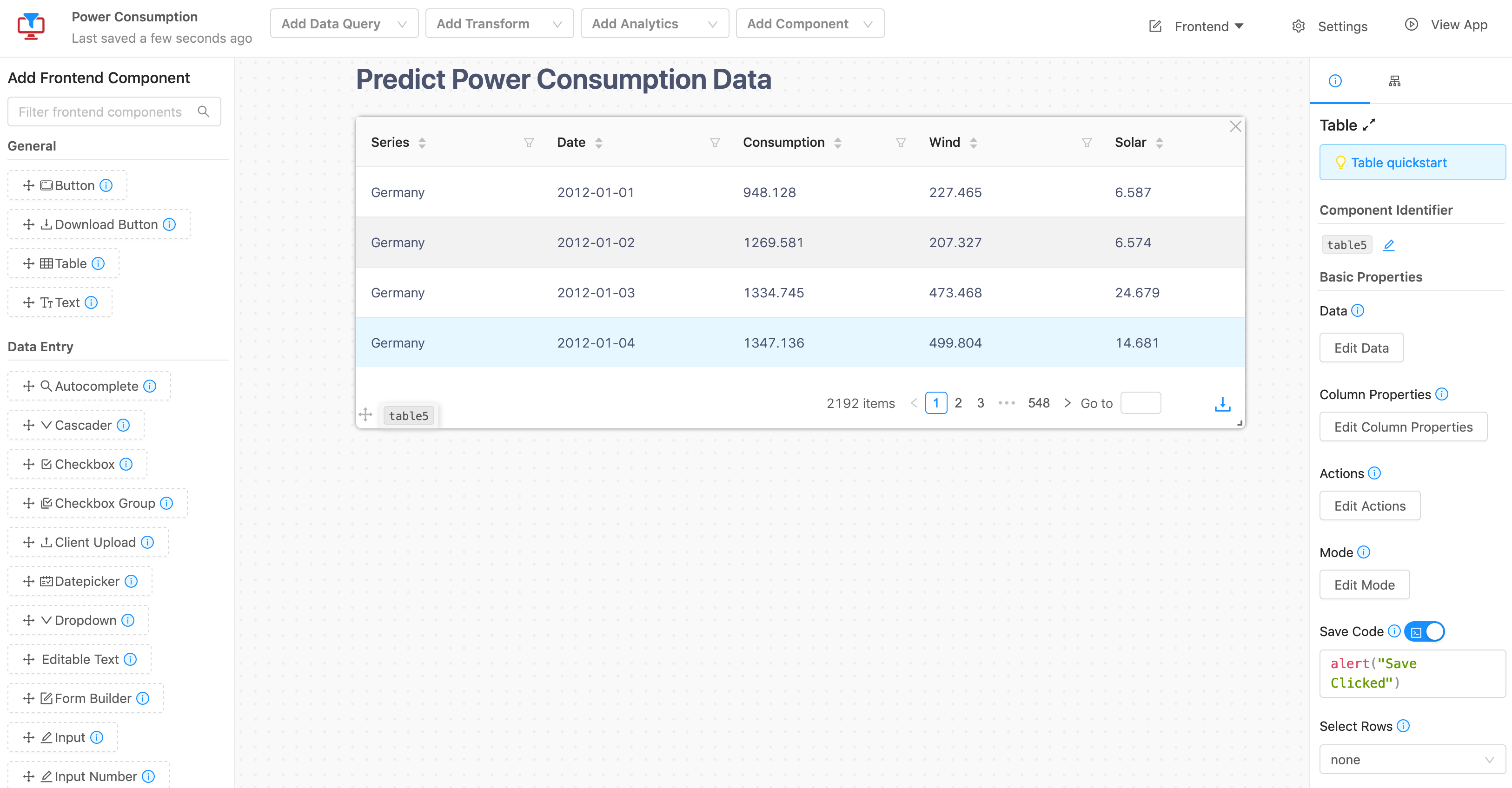
Now that our data query is connected, we would like to display the results in a table.
Drag a table component to the grid from the left sidebar. On the properties of the table (right sidebar), click Edit data.
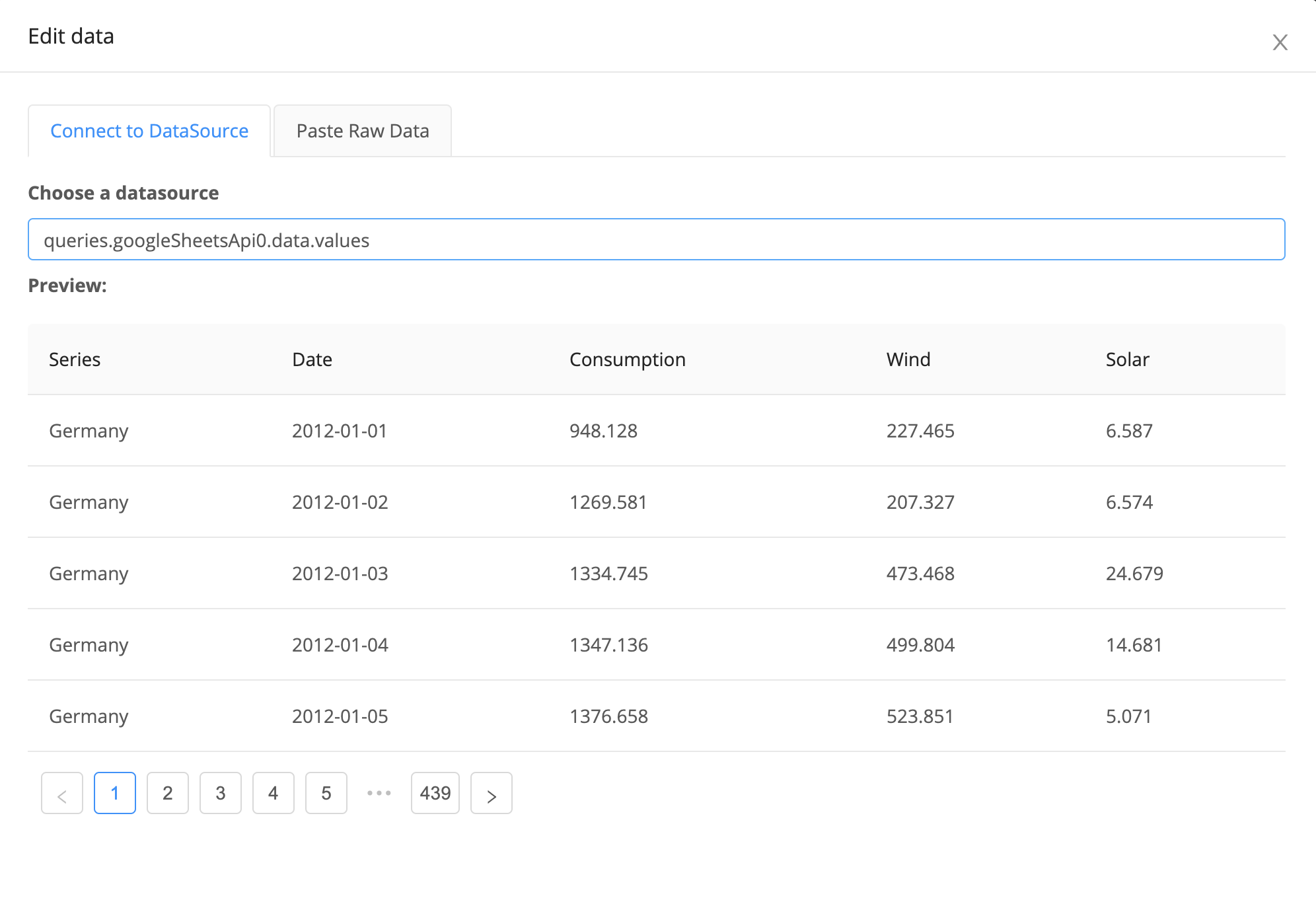
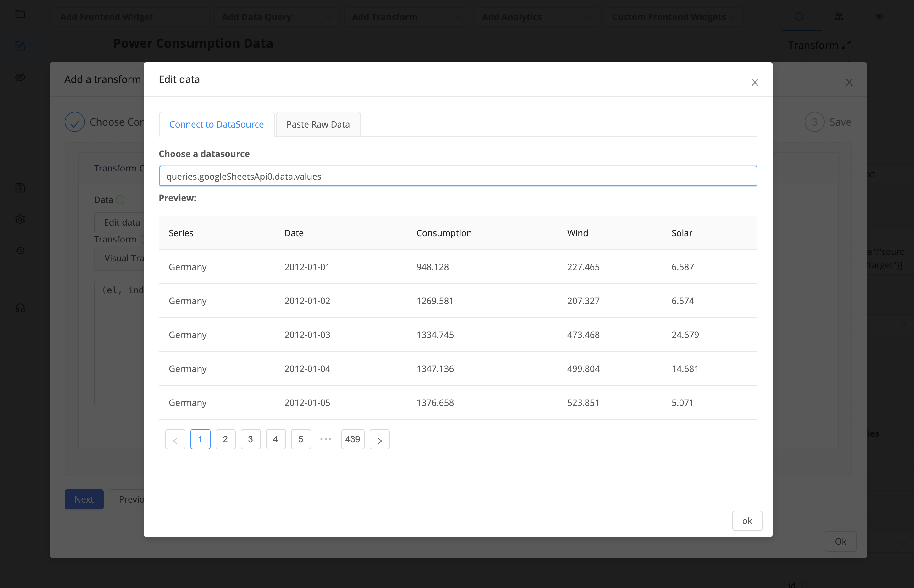
For the datasource, choose queries.googleSheetsApi0.data.values. This will ensure that the data.values property of the googleSheetsApi0 query is displayed in a table.
Although this data is good as-is for display into a table, we need to run forecasting on it as well. For us to forecast results from our data, we need to process it in the right format for our Analytics component.
We will do that using our transforms! To begin, click Add Transform on the top menu.
What are transforms good for?Transforms, such as the one we're about to create, allow you an easy way to mix and merge data sources together, filter them, or write code to get it into the right format before inserting it into a database. You can write raw javascript, client-side SQL, or other transforms to get started quickly.
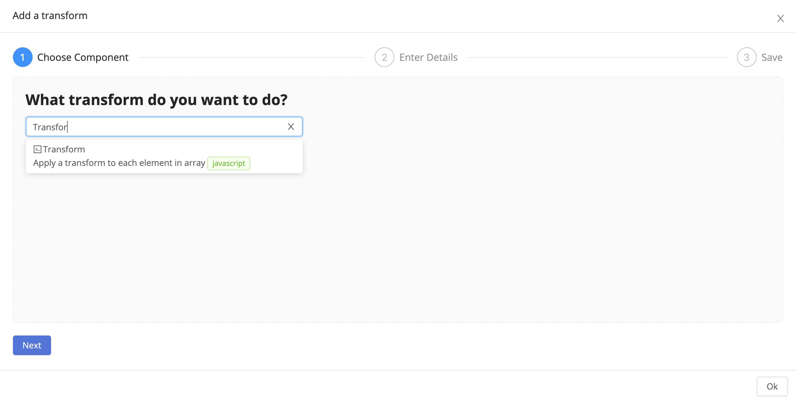
Select the Transform type.
Click Edit data and select queries.googleSheetsApi0.data.values as your data source.
We need to transform the data so it has the proper format for the time series component. Our time series component expects an array of arrays as the input. So for the transform, paste the following code:
element => {
    return [
        element.Series,
        element.Date,
        Number.parseFloat(element.Consumption),
        Number.parseFloat(element.Wind),
        Number.parseFloat(element.Solar)
    ]
}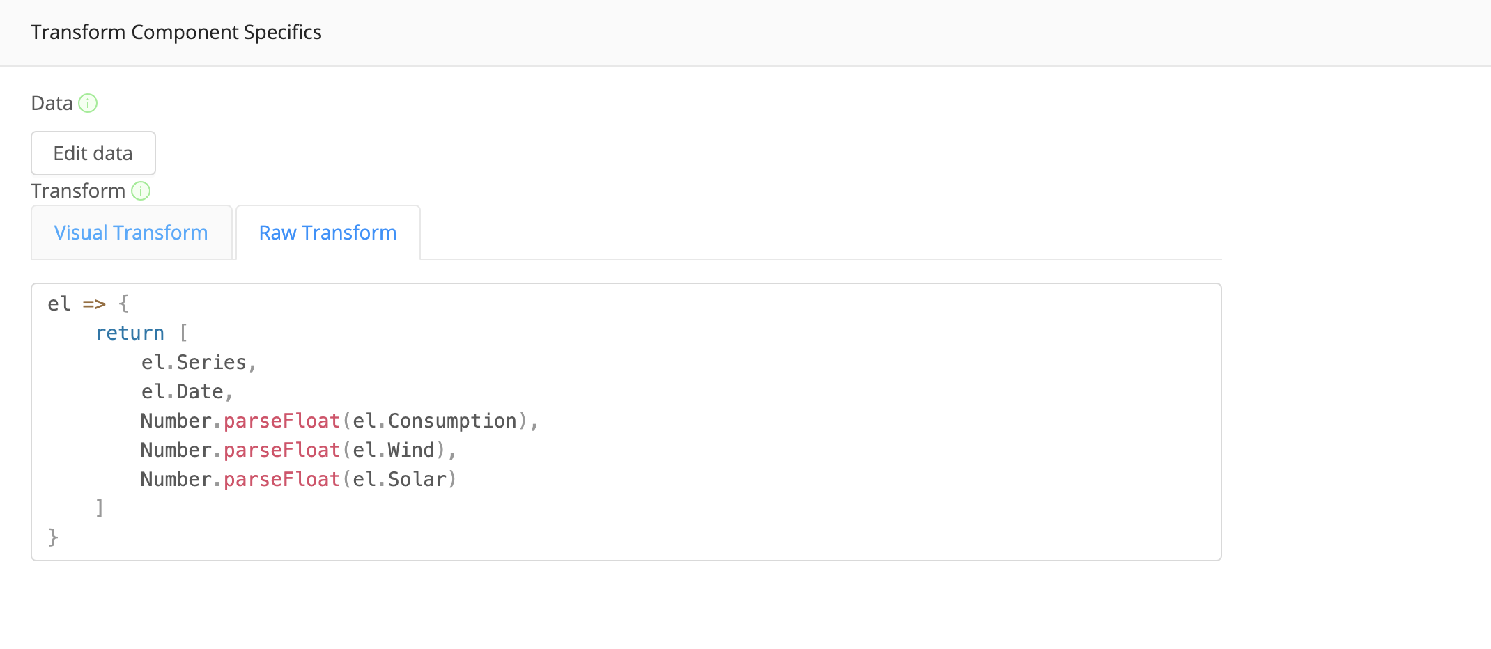
This transform, which runs on every row in the input, will convert each row into an array. Save the transform component.
Adding Analytics #
Now that we've loaded, displayed and transformed the data, we will perform analytics on it!
Add an analytics component of type time series.
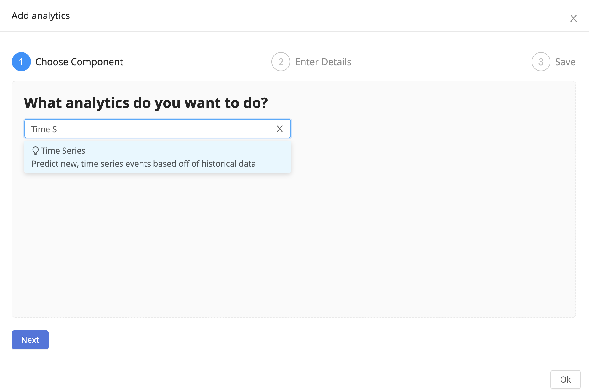
For the Analytics Type, choose Datasiv Forecasting, our proprietary forecasting component.
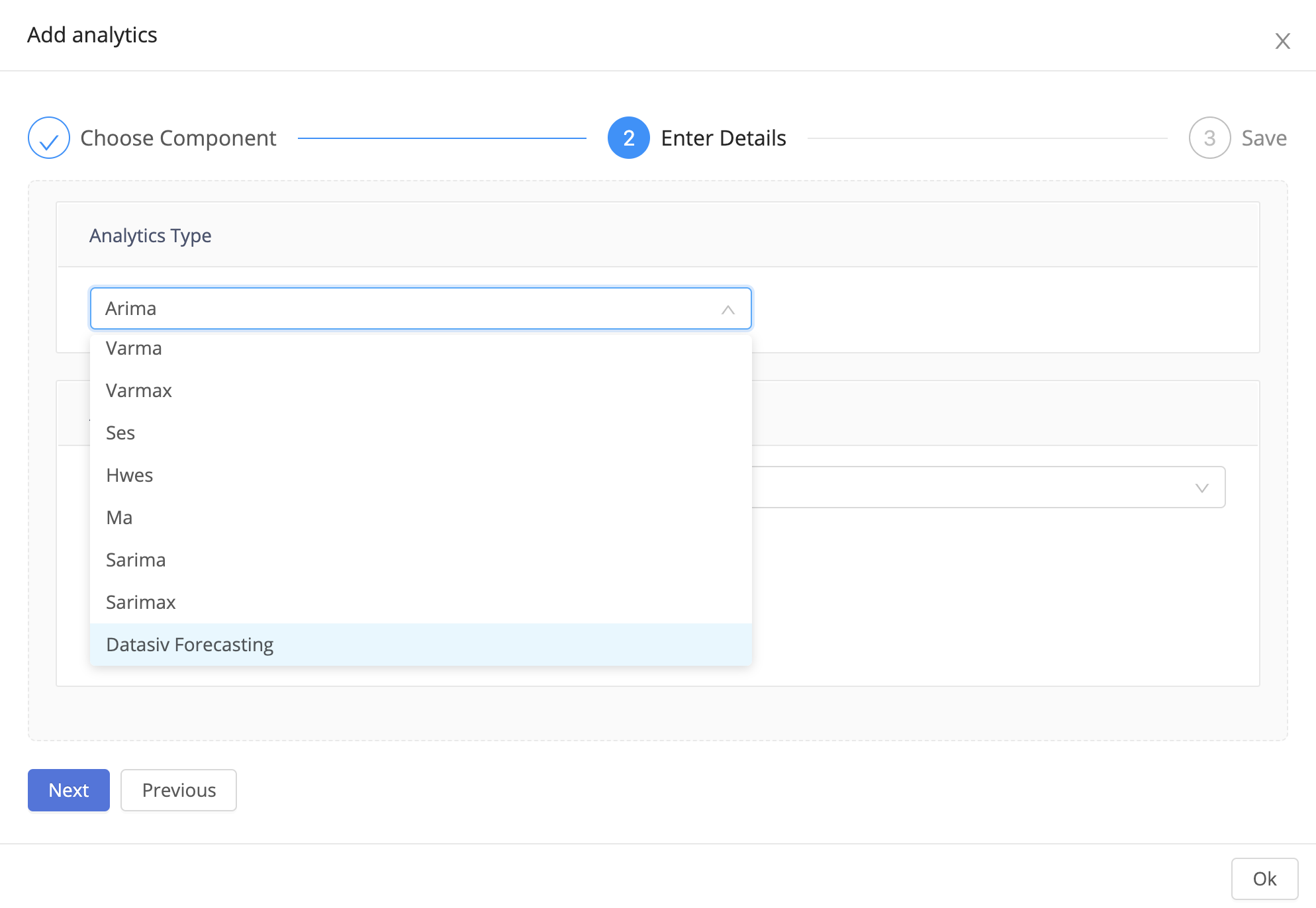
What is Datasiv Forecasting good for?Our forecasting component currently performs well in settings that range from single time series to heterogenous, multiple, intertwined time series that have seasonality.
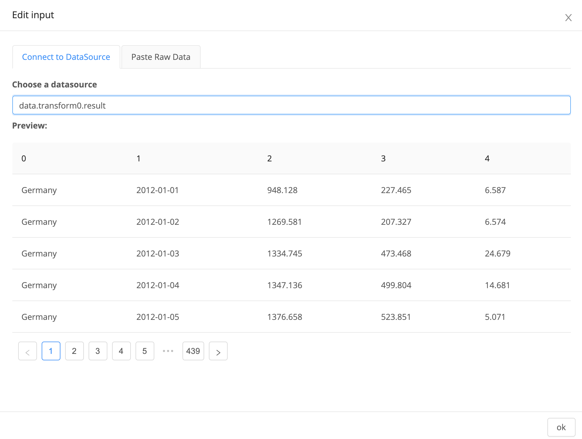
The Forecasting analytics component forecasts data on the input property.
Click Edit input, and select data.transform0.result, the output of the transform component you previously created.
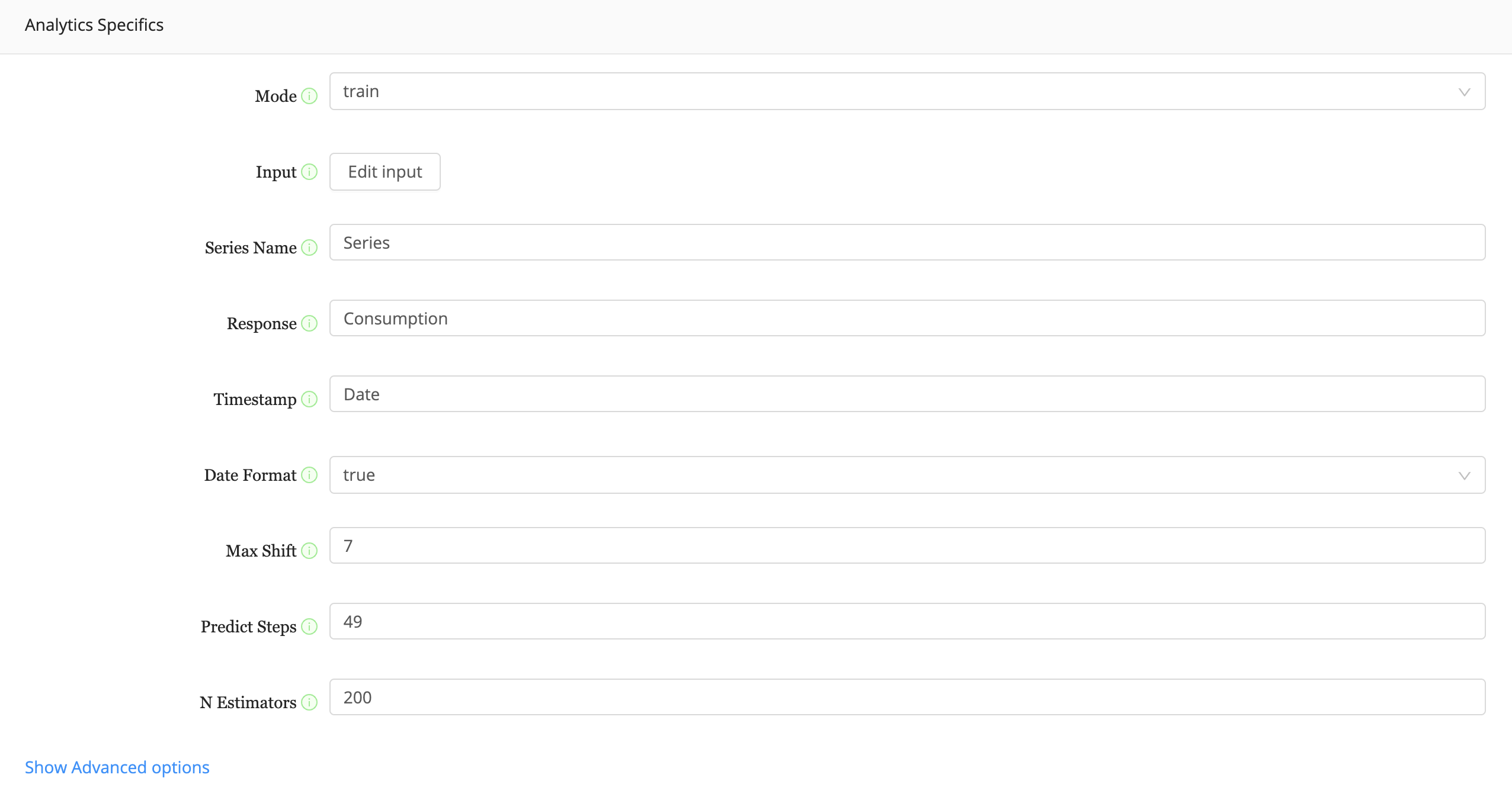
Set the remaining parameters for analytics specifics as defined below.
Series Name should be Series, Response should be Consumption, Timestamp should be Date, Date Format should be true, Max Shift should be 7, Predict Steps should be 49, and lastly the N Estimators should be 200.
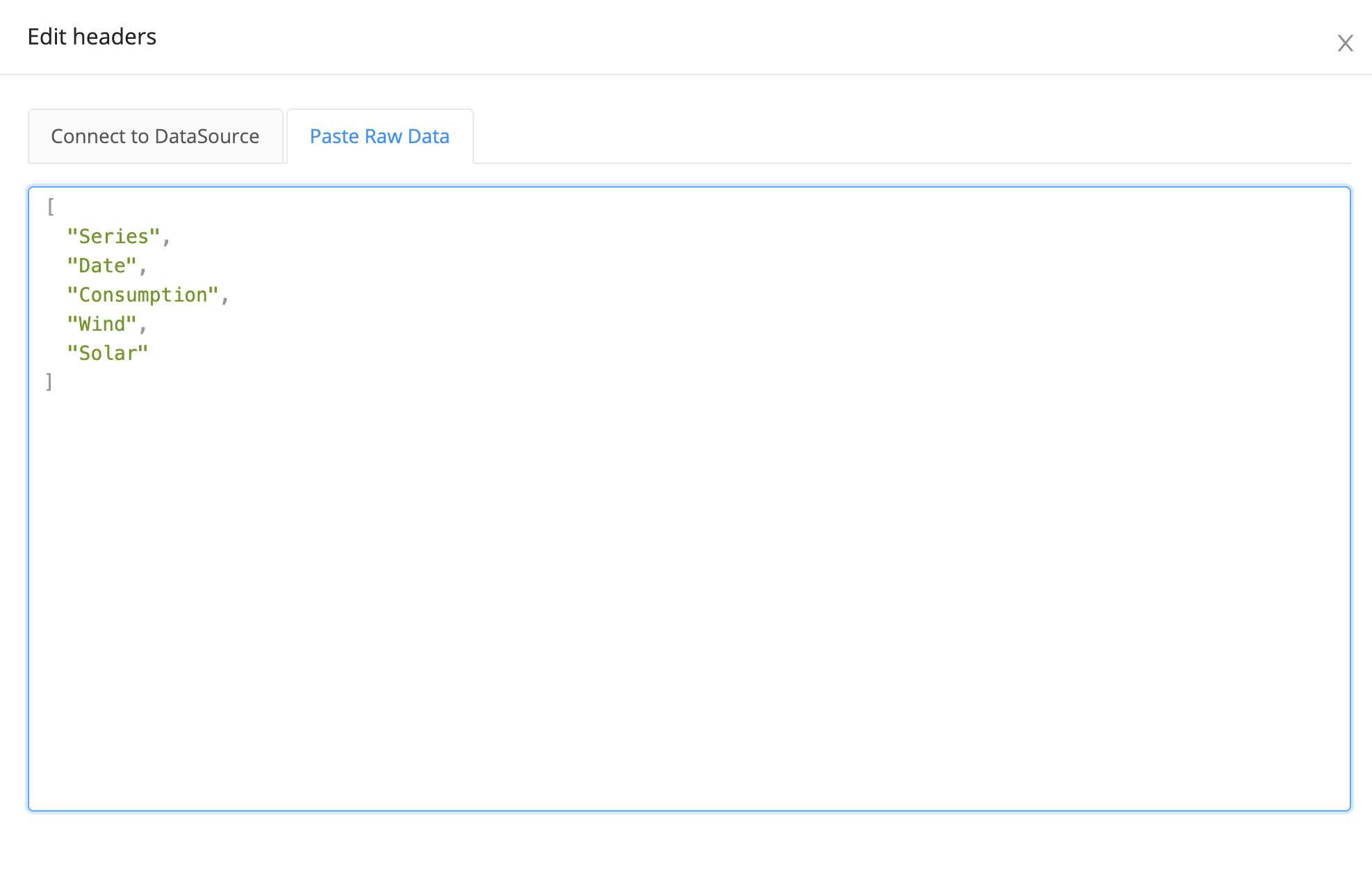
We also need to describe which entries in the input correspond to which properties (Response, Series Name, Timestamp).
To do so, click Show Advanced options, and click edit headers. Paste the following json array:
[ "Series", "Date", "Consumption", "Wind", "Solar" ]. This will define what each column in the input represents.
Congratulations! You've created your analytics component.
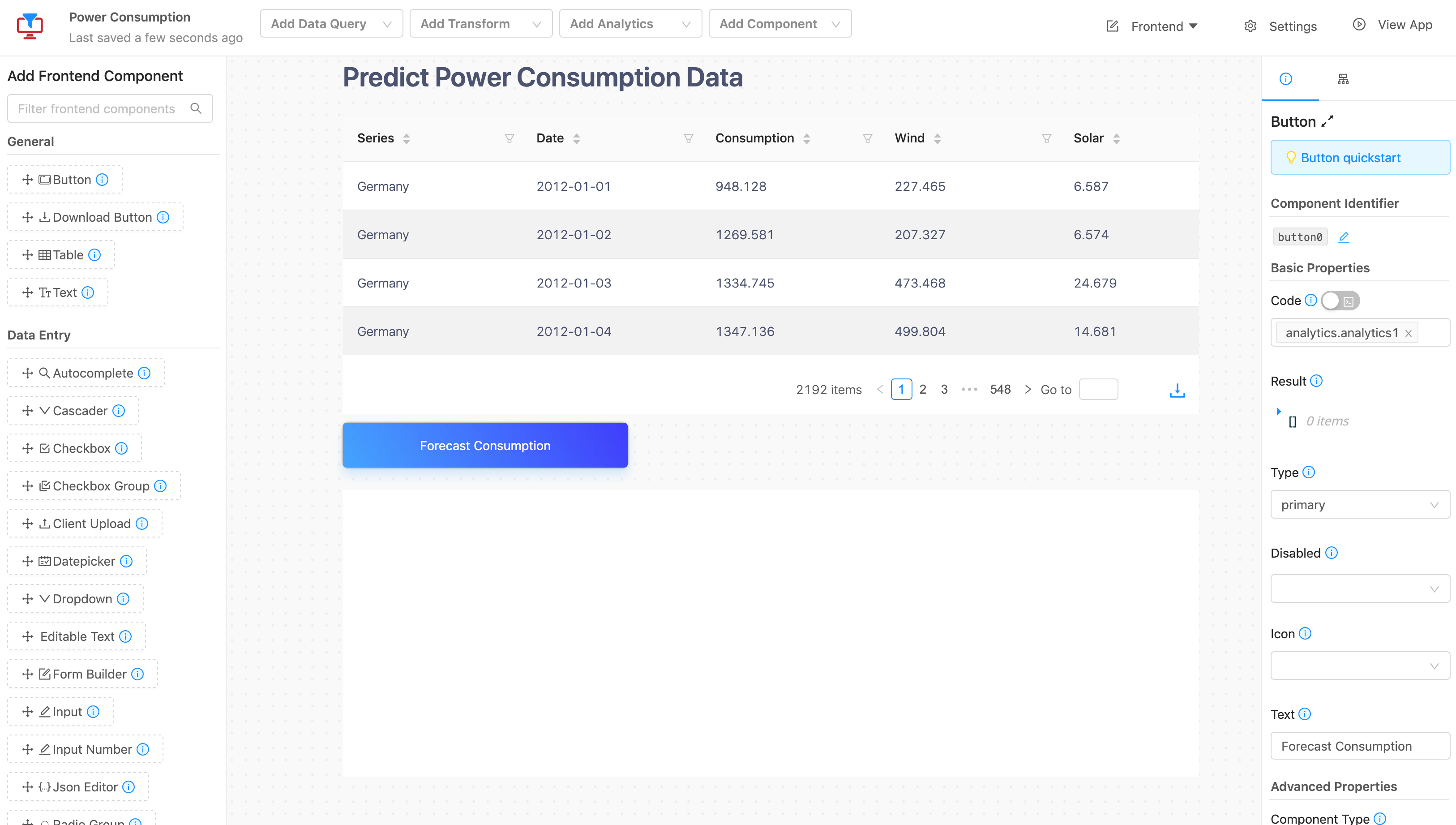
We'll add a button that allows us to call our analytics component.
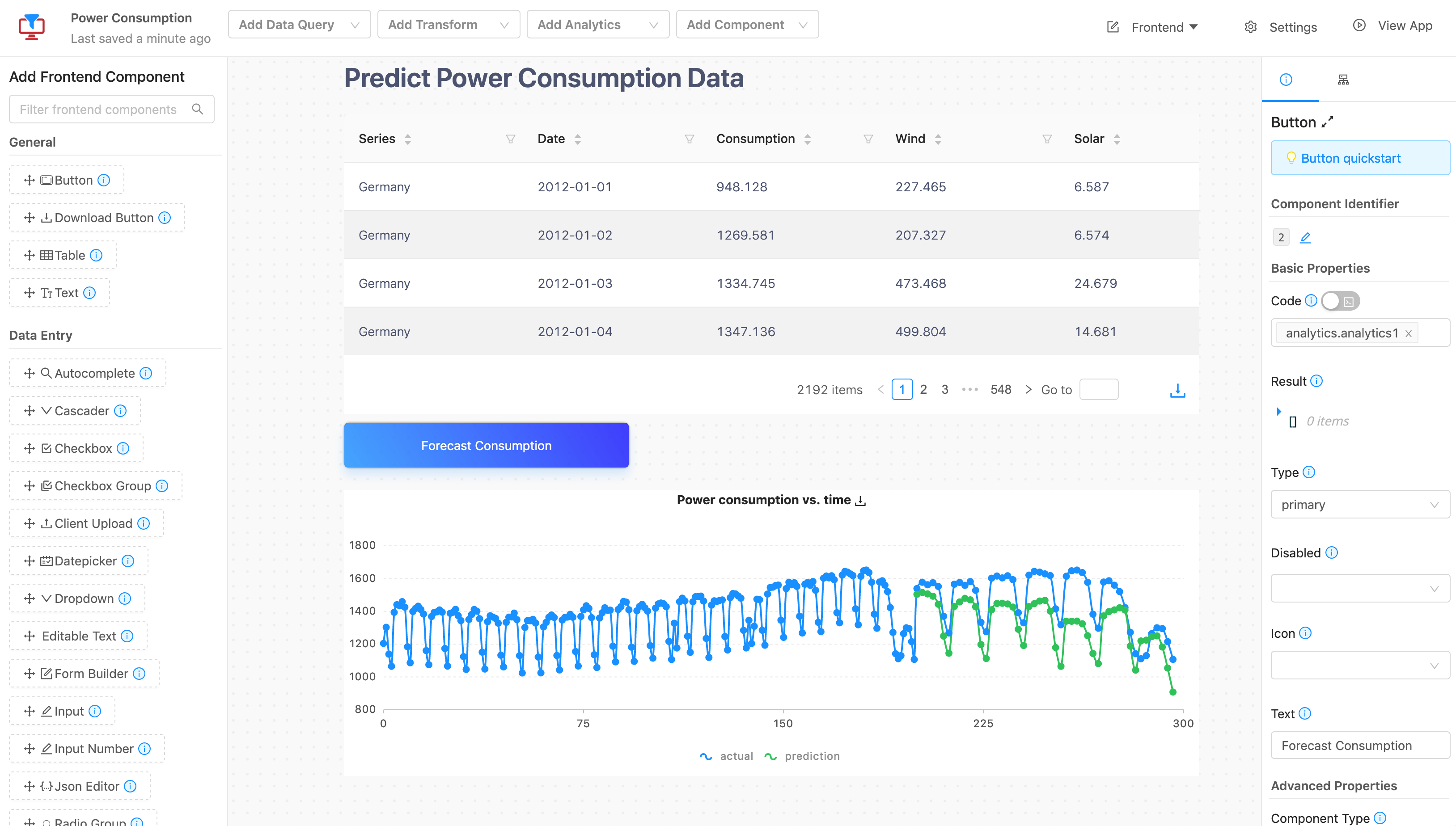
Now, go back to the main menu, and add a Button. Change the text to Forecast Future Consumption and the code to DataSiv.ExecuteAnalytics("analytics.datasivForecasting0", {}). This will run the forecast component on button click.
Triggering Analytics QueriesLike data queries, the button's code property allows you to specify and trigger data queries with the special
DataSiv.ExecuteQuery(...)function.
Click the button to run the analytics component.
Displaying the results of the analytics component
Finally, we want to display the results in a line chart, side by side with historical data. To do so, click Add Frontend Widget and select Multi Line Chart V2.
In the properties menu on the right, click Edit Data and choose analytics.datasivForecasting0.data.modelPredictions as your data source. This will connect the outputs of the analytics component to the input of the chart component.
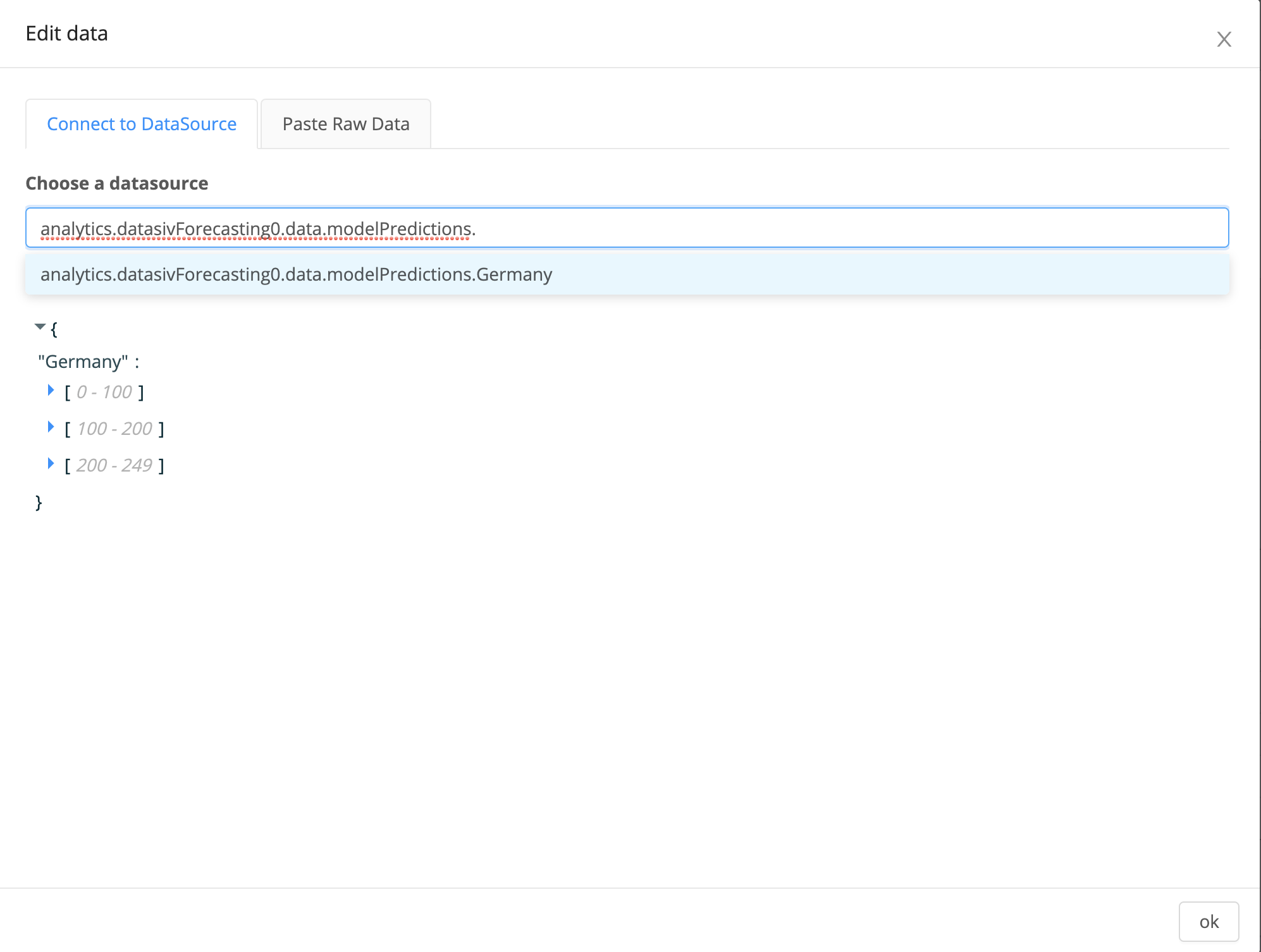
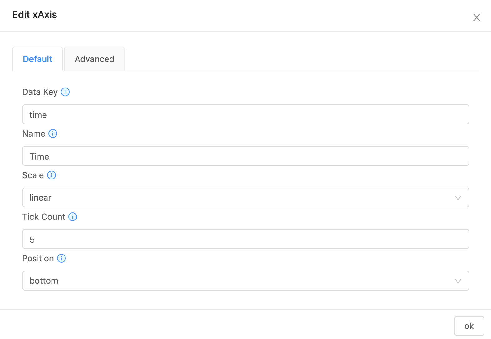
We need to specify which fields in the data array correspond to the x and y axes. To do so, click Edit xAxis and enter the following values.
The Data Key should be time, Name should be Time, and all of the other properties should be unchanged.
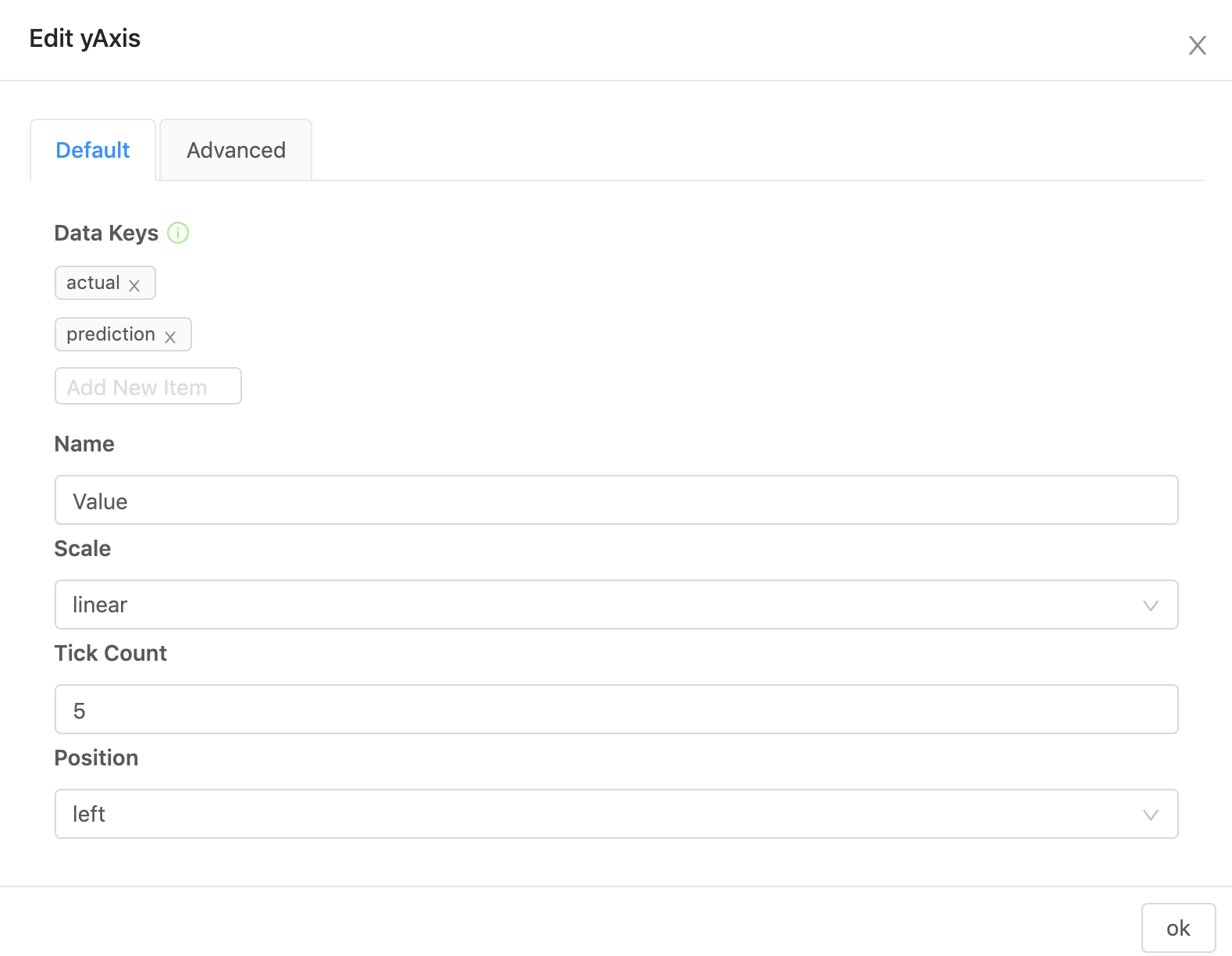
Next, click Edit yAxis and enter the following values.
The Data Keys should be actual and prediction. The Name should be Value, and everything else should be unchanged.
Congratulations! You have built an end-to-end system that loads in data, transforms it, and runs time series forecasting on it.
When you click Forecast Consumption, you should get a plot like the one below.
Updated 8 months ago
