Charts and Graphs
DataSiv comes with a suite of charting and graphing components.

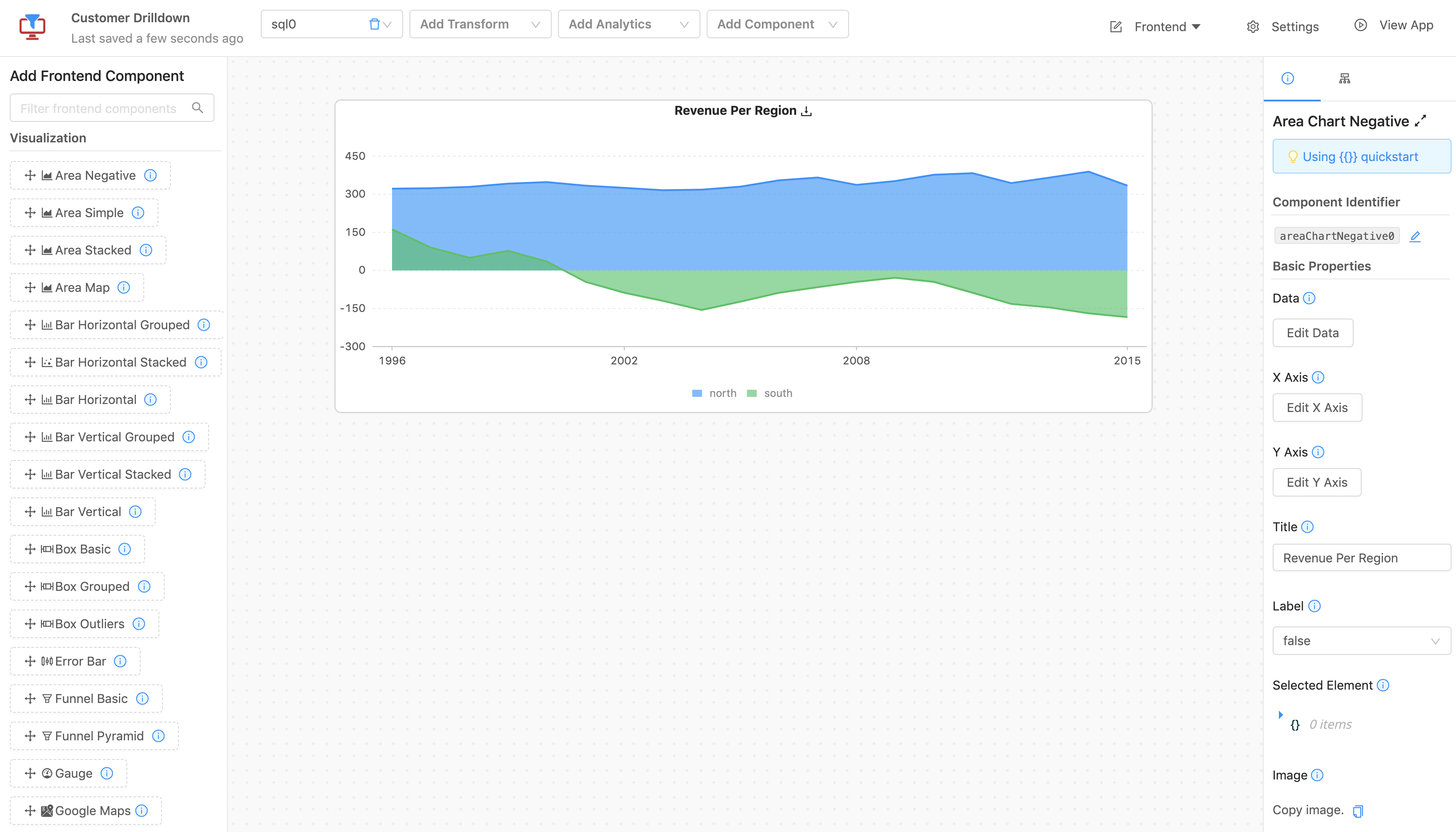
To create a new chart or graph, start by dragging a visualization component into the grid from the left menu bar.
Adding a new visualization component typically requires several steps.
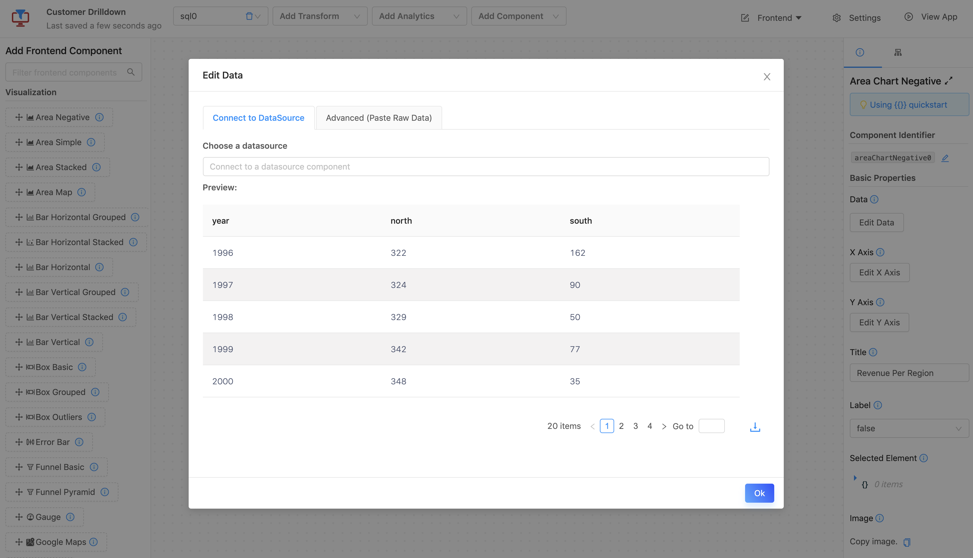
First, you select a data source by clicking Edit data.

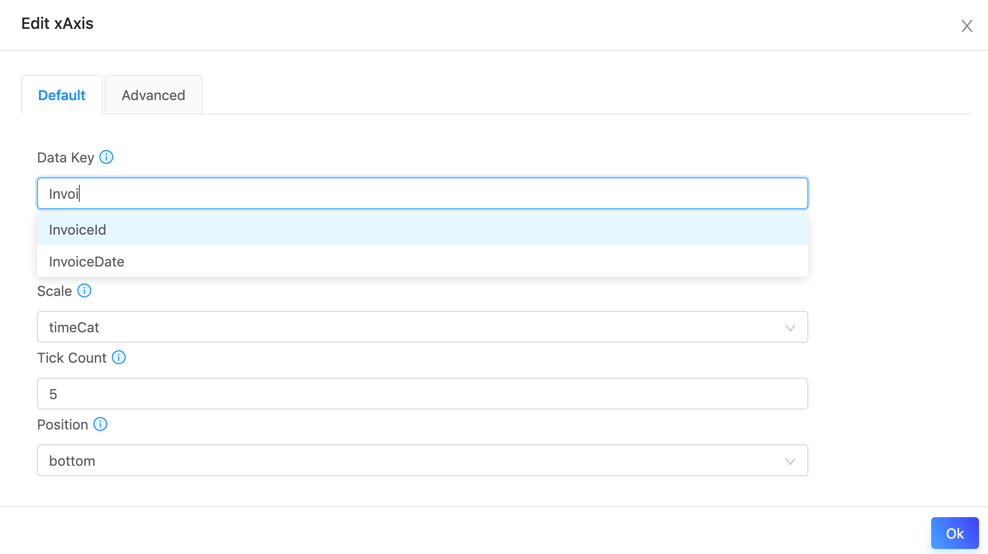
Next, you set the X Axis properties by clicking Edit X Axis.

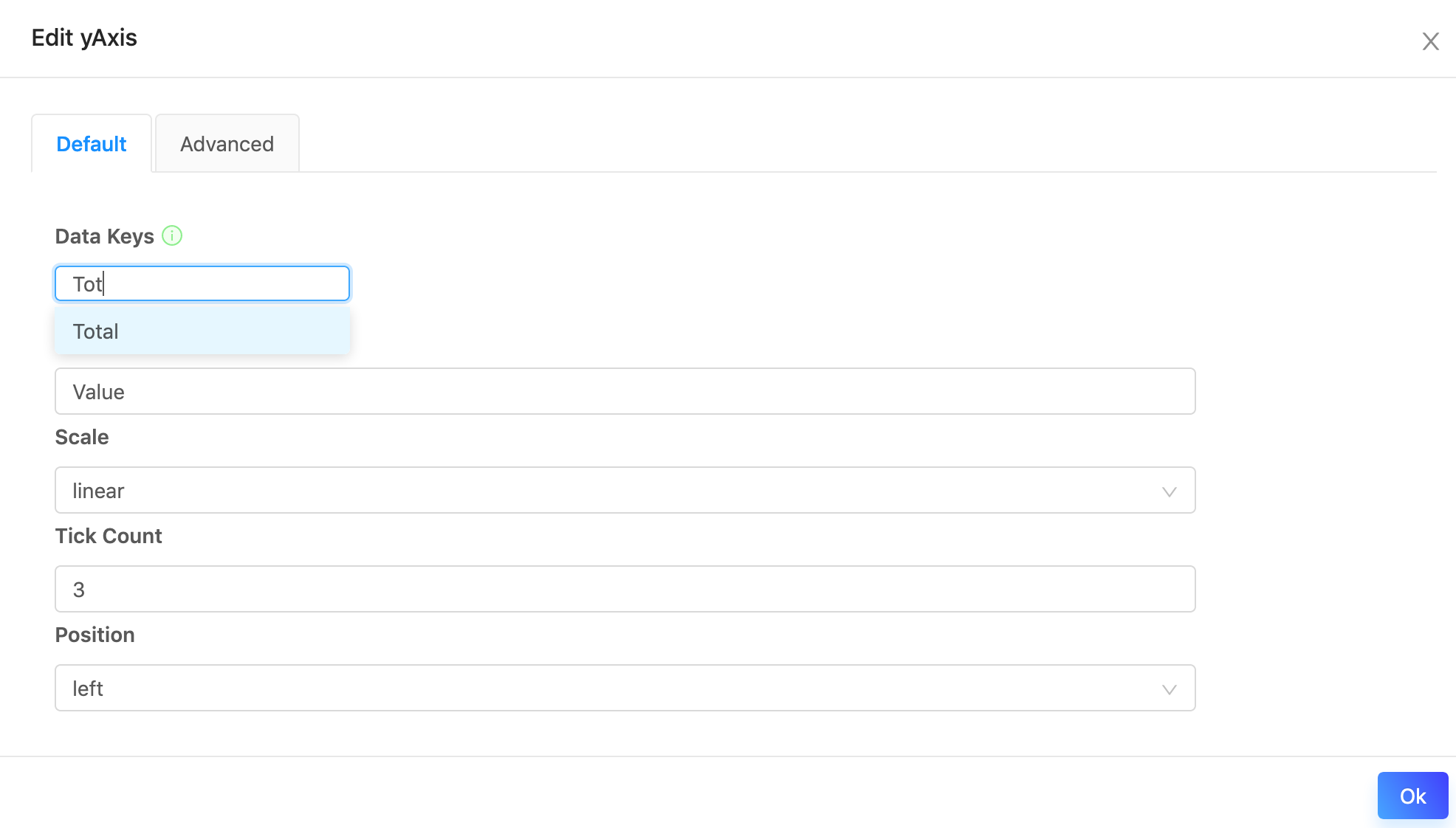
Finally, you set the Y Axis properties by clicking Edit Y Axis and selecting the appropriate fields.

That's it! Your chart is ready to go.
Updated 8 months ago
